
Archive for June, 2009

30
Jun
09

Posterize!

_DSC0118-Edit-poster

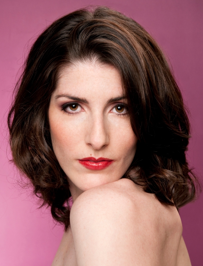
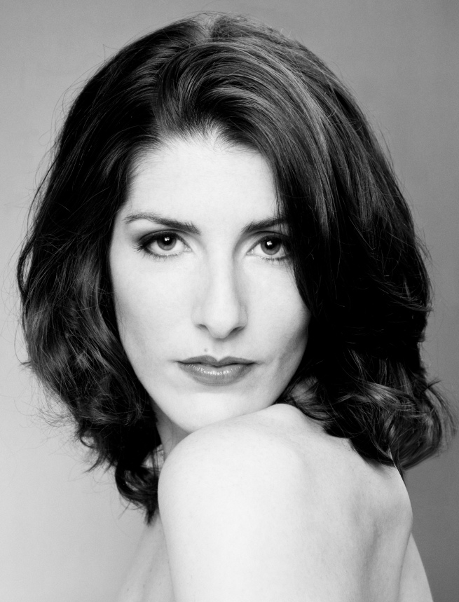
This is a posterized image of a lovely professional model named Carra,  with whom I’ve worked several times. (You can see more images of my recent shoot with Carra by clicking here. )

Posterized pictures have been popular since the 1960’s. Think of Andy Warhol’s images of Marilyn Monroe. The most famous recent posterized image is the photograph of President Obama that was used in the campaign, with the word HOPE along the bottom.

Wikipedia defines the posterization process:

Posterization is a process in photograph development which converts normal photographs into an image consisting of distinct, but flat, areas of different tones or colors. A posterized image often has the same general appearance, but portions of the original image that presented gradual transitions are replaced by abrupt changes in shading and gradation from one area of tone to another.

Posterized pictures are not to everyone’s taste. I like it in this image, as it accentuates the features of Carra’s face. And while the image is flattened into distinct tonal ranges, we can still get a good idea of what Carra looks like. Our mind can recreate the variations that the postrization process has taken away.

The photo editing software I use, Photoshop CS4, has an easy filter to posterize an image. There are many adjustments that can be made, including the degree of posterization – how many different tonal ranges are included. You can adjust the image to taste. Like many things in Photoshop, you usually don’t want to overdo it.

Here are the two orginal versions of the image. first, in color:
_DSC0118-Edit

and then a black and white version. The three are very different in feel. Which one do you like most?
_DSC0118-EditBW

18
Jun
09

Elegance in Simplicity

IMG_0008

I recently visited Philip Johnson’s Glass House, perhaps one of the two most important private homes in the country (along with Frank Lloyd Wright’s Falling Water).  After Johnson died in 2005, the house was donated to the The National Trust for Historic Preservation and opened to the public in 2007. The property includes a dozen or so buildings and 47 acres of land, but I wanted to write just about this iconic house.

The design could not be simpler. It is really a small (65 by 32 feet) glass box. Except for a brick circular column (see the picture above) that houses a fireplace and a tiny bathroom, the space is one big room, which includes kitchen, dining  and sitting areas and Johnson’s bed. That’s it.

This is not a practical house for sure. For example, there’s no air conditioning and no windows. So, on hot summer evenings, Johnson would open all the doors (four, one on each side of the house), turn on floor spotlights in the four corners of the house and turn off all the other lights. He  and his guests would sit in the middle of the  space, in the dark. Bugs would come in, go to the corners, and mostly get burned in the lights. In the morning, the house staff would come in and sweep up the dead bugs. There are probably a few creature comforts each of us would find missing in this house – like windows and screens. Or closets – there are none.

And yet, the space is absolutely beautiful. One gets a feeling of calm, peace and tranquility just being in the building. there is an amazing elegance in the simplicity of the design.  Johnson chose all the furniture very carefully and placed it in a very specific way in the space.

IMG_0018

When you are in the house, the whole focus is on the the natural setting you see outside. In some ways, you forget you are inside a building.  I fell in love with the house.

It’s hard to design a very simple building.  Deceptively hard. It’s hard to set up and take a simple portrait photograph. There’s usually something distracting in the background or in the clothing. In my portraits of people, I usually try to reduce everything down to the basics. Keeping the image simple and uncluttered makes for a much more powerful impression on the viewer – and a classic look. Johnson’s house is very modern in design and yet there is a classic and timeless feeling. I’m drawn to the same influences and sensibilities in my photographs of people. 

For more on the Glass House, see this website. You have to buy tickets way ahead to see this house, which is in New Canaan, Connecticut. It’s worth it. This is a very special place.

08
Jun
09

Lifestyle Images

_DSC0242

In my work with models, there is a variety of different kinds of images we shoot, some with confusing and overlapping names. Beauty, Glamour, Fashion, Editorial and Commercial to name a few. One of the categories is Lifestyle – images that often include props and look like pictures from a catalog.  This shot was composed carefully but with the idea that it would look casual and spontaneous – perhaps a woman having morning coffee with a friend.

In my shoots with clients that are not models, I will often set up a lifestyle look. If can just provide a bit more interest – and more fun – than a typical studio pose.

here’s another Lifestyle shot of Diana:

_DSC0142

And finally, while this is not a Lifestyle image, I wanted to post this head and shoulders picture of her. I like the angle of her head, the line of her neck and shoulders, and her lovely smile. I purposely shot this image with somewhat soft lighting to capture a feeling we were trying to create for Diana’ s portfolio.  Hopefully these images will lead to many modeling gigs for her!

On my website, you can view more pictures from the shoot with Diana, by clicking: this gallery.

_DSC0037-Edit

02
Jun
09

Cropping and Negative Space

_DSC0212

This is a picture of Cara. Cropping an image is challenging. There are certain rules – don’t cut off hands and feet, for example. But sometimes it makes sense to break the rules.  In this image, I primarily composed the shot in the viewfinder of the camera and further cropped a bit in Photoshop. I wanted Cara’s face to be large enough to see clearly, and it just felt right to cut the image off at her waist. So, her arms ended up being cut off below her elbows.

Does this look OK to you? Everyone will have a different interpretation, but for me, there is enough interest in her beautiful face, the lovely dress and the way her hair is spread out on the blue paper.  I can imagine how the rest of her arms and her hands look – I don’t need to see them explicitly. And, we’re already looking at Cara in an unconventional way – sideways – so another rule has been broken.

When I crop a picture, part of the creative decision has to do with negative space. Negative space is the space outside the main subject – in this case, the blue paper Cara is lying on. I chose the blue color carefully to work with her dress and tanned skin tones.

Take another look at the image and just focus on the negative space – the two small triangles under her arms and larger space that meanders around her body and hair.  Are the shapes pleasing? Do the tonal changes between the lighter areas and the darker shadows 0n the paper make the picture more interesting?

When we look at a photograph, we often don’t consciously think about the negative spaces. But the negative spaces can make or break the picture.

Here’s another image from the same series, showing Cara’s full body:

_DSC0209

How does the crop work? How does the negative space work?  This is a more conventional picture for sure, a safer picture to take. I find the first one more engaging – it holds my attention longer.

Photo tip: Be intentional about cropping an image. Think carefully about how the negative space will look.


June 2009
S M T W T F S
 123456
78910111213
14151617181920
21222324252627
282930